

third-party android modifications*
my family’s pixel devices, and mine running gos, don’t have this. nor the cell bar style, nor the ‘we have to advertise the wifi version so people feel good that bigger number = better’ wifi icon style…
the default is just a battery icon, though I have it set on my phone to also show the percent alongside it. this hasn’t changed in many years. blame your manufacturer and their skinning and modding.
Yeah seeing the post had me worried for a while but appears it’s not and android thing but a Samsung thing. This is why I stopped buying Samsung phones 6 years ago.
Oh thank God. I’m probably going to update my Pixel soon and was worried
OneUI 7 is visually a steaming pile of shit. Real “we have iPhone at home” vibes throughout. Specifically for me what they’ve done with icons, why cant i have white or colored icons with dark mode?
Beta testers complained so much up to release how uncohesive everything is and Samsung constantly shut down feedback with “this doesn’t meet our design goals”. Surprise, now it hits general public and everyone still hates their goals. This won’t ruin them, but it defintely makes me reconsider Samsung going forward.
Edit - yes I know there’s third party solutions to most android problems, but shouldn’t have to load apps and spend hours customizing to interface without vomiting.
I hate how ultra round everything is. Especially sliders like for volume feel so weird and look that way too. I really liked the OneUI 6.x rectangular design with rounded corners way more.
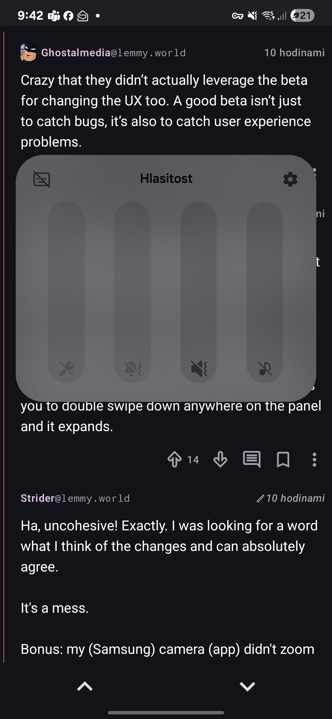
The dropdown panel is also stupid. It’s just so incredibly clumsy as you have to pull it down from very top, meanwhile the other mode allows you to double swipe down anywhere on the panel and it expands.
I am not sure if it is intended to look like this, but how the fuck am I supposed to read my volumes now? What the fuck is this contrast? I have to wear glasses, but without them I could manage (like, when I wake up), but this is now almost unreadable without them. Same with battery.
The volume looks good for me

Sorry, I am a smooth brain. I had everything set to off and apparently didn’t realize. Mondays…
Crazy that they didn’t actually leverage the beta for changing the UX too. A good beta isn’t just to catch bugs, it’s also to catch user experience problems.
All of my family members have Samsung phones and every single one of them has been complaining about the update. Normal people, tech people, it doesn’t matter. They all hate it. It’s actually kind of insane. The only reason I have been spared so far is that my phone is too old to get the new OneUI update. I can’t imagine any of them will buy a Samsung next time they buy a phone if the UI stays like this. People who buy Android phones are people who like Android phones. You’re not going to lure iPhone users to Android by being more like an iPhone because they’re just going to buy the real deal instead. It’s just stupid. Just the battery icon discussed in the OP was the source of a lot of complaints because it is extremely hard to read especially for older people.
Ha, uncohesive! Exactly. I was looking for a word what I think of the changes and can absolutely agree.
It’s a mess.
Bonus: my (Samsung) camera (app) didn’t zoom when I pressed 3x and after I pinchzoomed manually, I could not take a photo (button did nothing). That never happened before and I missed a good shot 🤬. Afterwards it worked again. Hope that’s not recurring…
To your edit: that’s one of top 3 reasons I moved to iOS and while there are annoyances, overall I’ve been happy with it for 3 years. Not suggesting everyone should switch but if you’re tired of tinkering, it’s a good option.
I hate the new top pull-down menus.
If you pull down and tap the little pencil to edit, then go to panel settings, you will find the option to change the pulldown menus from separate back to together. It made me less irritated but I still dont like the new look.
Thank you for sharing this
I changed that as soon as I got into the the wrong thing for the fifth time by accident.
Maybe it’s my (front display) slim phone but who designs shit like that?
Why? I’m really frustrated it right now because I’m not used to it, but the settings drop down always felt cramped and this logically makes more sense. I can’t think of an instance where I simultaneously wanted to see notifications and settings. Seems to make sense to separate these. I also thought it was annoying when I switched from the little nav buttons at the bottom to gestures, but man I can’t imagine being without gestures now.
Tbh I actually got used to it since posting that comment
that’s just samsung though, i’m on android 15 too and my battery looks like a battery
i just updated to latest lineage and the only change to my battery icon is that it shows a little shield icon when charging is paused, which is very nice and i particularly appreciate that it works seamlessly with non-built-in ways of limiting charging! (acca specifically in my case)
Shitty Life Pro Tip, just keep your battery below 19% and they can’t update.
taps head 😎
I filled up my storage and now I just get download failed notifications every morning. Happy accident, but now I won’t ever empty my storage again.
They should’ve just copied iOS and made it look like a little battery.
The arrow shows on which side the battery is.
It’s there! ▶️
I genuinely feel for y’all not able to flash your own OS.
I bought a fairphone and have been running lineageOS on it.
I think it’s just that we don’t have roms tell our phones are eol?
That’s one aspect, but many phones are also just straight-up not jail-breakeable. It’s an unfortunate reality of the phone manufacturing world that they put up as many barriers as possible to try and prevent you from having free range with your phone.
Because for the average non-techy person, security is more important than freedom.
Life is busy, life is short, people don’t have time to be flashing OS and having to deal with their banking stuff breaking.
I mean, just look the iPhone marketshare
The average user doesn’t give a fuck about security. They use whatever manufacturers put in front of them because the alternatives are not known or reasonably available to them.
True, but if you had the ability to flash your OS, there’d also be the potential of using a third paty repair shop to get it flashed with a new OS. That would be about the same experience as getting a new phone, but cheaper.
“For security”.
Maybe. Just not mine.
Ohh yeah, Samsung will
- Disable Knox
- Prevent updates to Oneui + Android
Edit: i thought this was a samsung sublemmy, I missed Lemmy shitpost, but im not deleting what i typed i feel like i spent a good half hour bitching about it and frankly feel more vindicated seeing others complain.
full rant if you want it
I hate the battery not looking like a battery. Minor complaint tbh, I dislike it but I might come to like it.
Notifications now stop at 3. Why. Why the fuck. I moderate discord and modmail pings me 17 times an hour. I want to see that I have a text in Notifs, and now it just shows 3 discord icons when opened - I have to open the full tray. Negative user experience item
The split trays was fucking stupid. I have a fold and I STILL hate it. Fixed it in settings. Negative user experience to have forced it rather than asking. Moderate item since you can reverse it.
Adding 6 “quick items” at the top of the Tray is nice, since they fucked with the tray. It’s like…“we know we made the ui worse so here have quick access to 6 items you actually wanted as an I’m sorry present” The whole Tray is very iPhone. I did not pay for a Samsung to get an iPhone. People are welcome to like them, I’m not here to hate. But I specifically bought a Samsung phone with Samsung styled ui - if I wanted this feel id have gotten an iPhone.
Spotify now has like this…loading screen? It tells me when i have no service and won’t even open the app if I’ve lost internet (data off and walk too far from wifi) Difficult to see the upside to this “live status”. Minor poor user experience.
Google assistant has been removed from the bottom left swipe. Holy shit i hated that move. Why the fuck was it in the bottom left in the first place. Even worse, now it’s fucking Gemeni. Ai is actually ass. Turned it off and disabled it. Disabled the tile in my apps. Putting AI on my phone is a hard negative especially with the next item
Google assistant now no longer works. It just makes Google searches. I now no longer have a hands free way to tell my phone to “call (contact)”. Gemini did not recognise this command and is part of why I disabled and removed it. Now GA doesn’t either - continuing the trend of making GA more and more useless. This is such a hard negative actually has me considering turning Bixby on. Using the full phone book when I used to be able to tell my phone to call people is such a shit maneuver. Very, very poor user experience.
App drawers looks clean. Looks smooth. Reorganization is fine. Positive user experience.
They changed something about Home Screens but I dont know what. I feel like they shrank the icons? Gave me an extra row? Something. Feels off now. Somewhat poor user experience because the user is left feeling paranoid about what did or did not actually change.
voice-to-text was removed from the keyboard and then hidden and moved to the bottom left last. You know, the same spot Google assistant was also placed last update. Actual dogshit user experience hiding the VTT and making me dig through the internet to put it back. The fuck was this choice.
Overall negative and has me rethinking keeping with the Fold line given their price. If anyone has a Launcher to fix some of these issues or to restore voice text making calls, I’d appreciate it.
I hate the battery not looking like a battery.
Welcome to One UI 7 🙃
Yes, icons got smaller and a row was added. They also changed the weather app to be scalable (ie not every icon needs to be 1:1 squares, they can scale now).
I was able to merge everything on my second page into my first page, so now Inly have 1 “desktop”-like page with folders
My biggest issue is that now I dont see notifications when I open my phone and swipe down, I have to swipe down TWICE now. Once for the system menu, again for the notifications. Its like they switched the 2 panels’ priority
That’s really weird… Have you reverted the Notification panel back to it’s original behaviour? I have it like that and it works same as it ever was.


Thank you!
Thanks! As of this morning it seems like it’s working normally.
Re-upload, casually doxed myself

deleted by creator
Hey at least it shows the battery percentage unlike the old default option!
Old one with massive percentage number next to battery icon was so idiotic.
It was more readable, to me. So for people with waning eyesight this is a massive step back.
One UI 7 is the worst update I’ve ever suffered in my entire life.
Win7->10 wasn’t this bad.
It convinced me to finally order a refurbished Pixel 8 sp I can switch to Graphene.
I see you’re skipping windows 7→8 which is fair because most people did
There is no Windows 8 in Ba Sing Sei.
I was given an old Galaxy tab 8 on friday. I played with it for a while, and it was super snappy and quick.
Then it updated
then updated again
then updated again.
And finally again.
Ended up with OneUI6.1
Tablets like 1/3rd as snappy as it used to be.
If thats how big of a shit pile UI6 is, then I pray to god UI7 never gets on my tablet.
Yeah I am sticking with my custom rom until the phone dies. Then probably getting a Sony phonr because those apparently have a no nonsense android on them.
Yeah I’ve bought my last Samsung. These over-redesigned UIs that nobody asked for piss me off. If I wanted ugly Apple trash I’d buy ugly Apple trash.
I have two Sonys and love them both. I like that they’re thinner so it’s easier to hold, too. Still have headphone jack and side fingerprint reader.
Good to hear. I had a sony a while ago. Xperia Z1 compact I think. Great little phone it was. Sadly they now only make really high end phones anymore.
There’s always the 5 or 10 models. Those are still great and also pretty affordable if you scoop them on Swappa or eBay
I was actually thinking of getting a 1 year old model from ebay. Might reconsider again
deleted by creator
get a pixel and install lineage, it’s quite easy (you just need to fiddle with adb a bit) and you can achieve a 95% flawless experience. only thing that doesn’t just work for me is the fucking mcdonald’s app
I have an older phone with lineage. Currently using crdroid because I chose badly and nobody is really making custom roms for my current phone. I am not buying a pixel just because.
I hate that my music player is now relegated to a tiny nub at the bottom of the lock screen that defaults now to google ads for sports betting unless you turn it off.
Also my phone now randomly vibrates every so often, just gently enough to think it was imagined and I think it’s to drain the battery faster to push people to buy a new phone. But that’s just conspiracy from how garbage the rest of this update has been.
Hey so I had a similar problem with the random vibrations, I found that the update turned on Notification Reminders in settings for texts and missed calls. I’d double check those settings around that and I hope it helps you
“Alert when phone picked up”
Was the name of the setting turned on. In the motion settings.
Still not sure how they could have named that harder to find without writing it in Korean.
It’s sooo terrible. I updated my phone not realizing it was going to be such a big change & it kind of ruined my day.
I’d love to go with a different OS, but nothing has stylus support for writing and note taking :/
Dito. I thought it was a minor update and was greeted by ‘welcome’ letting me feel as if my mobile was reset for a few minutes.
Bad experience. And just because it needed to make absolutely sure I do not ignore the gemini AI.
I then ignored the gemini AI, out of spite alone.
I AM STILL PISSED ABOUT THIS FORCED UPDATE. the second a linux phone is usable daily I will buy one. FUCK SAMSUNG
Sounds like you already have one. Samsung phones are pretty bad though.
deleted by creator
Would the Google pixel not retain some line to Google? I’ve been leaning more and more towards getting away from Google and Microsoft. With Linux, I’m scared I’ll have an unsecure system just by virtue of not knowing dick about Linux except the little coding I’ve taken courses on that barely scratched it.
Only reason I got Samsung was the cameras on the S22 or 24 or whatever it is I have. Pixel has good cameras, I’ve heard, but it’s entirely Google. Does putting Ubuntu remove all that…?
Sorry if not the place to ask.
deleted by creator
Oh, interesting. Thanks for the heads up!
just get a phone with lineageos support?
It looks almost exactly like the apple one
It does not. Apple’s is a little battery. This looks more like a notification badge. Corner radius is too big, and it needs a nipple.
Not much that isn’t better with a nipple. Not going to argue with that
I heard that Samsung is trying to “Apple-ify” their One UI


