worked on it since 1998
Sidebar, it’s been interesting to watch the contrast between gimp and blender or even Krita which are truly industry competitive if not industry leaders.
Inkscape too.
Am I a joke to you?
YES
Jesus Christ YES
I’ve been using GIMP for 15 years and it’s a great tool for image editing. It doesn’t have the cool AI functions that Photoshop had even before generative AI became a thing, but for most common and advanced image editing needs, it’s a perfectly suitable tool.
AI or not GIMP is garbage. Basically every new normie opens it up, sees the interface and nopes out back into Photoshop
Actually most people don’t pay for or pirate Photoshop and most people need at least light photo editing
In that case, user nopes out and goes back to Paint
No serious photographers use Paint.
Been using GIMP since it got too hard to find an updated cracked warez zip file of Photoshop from Limewire.
GIMP is good for most people. The clone is not guaranteed to be maintained.
almost made GIMP a recursive name. ‘GIMP is for Most People’
GIMP Impresses Most People
Maintainance and/or support never can be guaranteed in vibe coded crap. Who would patch or update it? The AI?

Cuck coding*
https://github.com/kelseyhightower/nocode (no AI, FOSS, Apache-2.0 license)
vibe - i wish this worked
Gimp 3 came out this past year and I feel made massive improvements that I use often for my little simple projects but I think everyone still complaining about Gimp 2 because they tried it many years ago and said it sucks and went back to paying adobe.
most comlpains I met is about the name, not program itself.
Yeah its really embarassing to say out loud to people with the american (?) context/alternate meaning of “Slur for wheelchair users”
Ya I mean it stands for GNU Image manipulation program I think but I guess wouldn’t hurt to have a rename because I don’t think it’s fully a GNU project anymore and branched off iirc?
It’s any kind of handicap or physical disability/deformity
I’ve used GIMP many times. Every time I do, I fight with it for hours, try looking up tutorials for how to do things only to find out that everything is different in the tutorial compared to what is happening in my version of the program, and then I rage quit and use something else.
Sorry but I do not find GIMP usable. Not that I have any interest in the ai clone either. I’ve heard good things about Krita, so next time I need to edit something I’ll be spending some hours learning how to use that.
This.
GIMP may have good functionality (in GIMP 3.2), but it’s a software designed by engineers. Most workflows are more complicated than they would need to be. Sadly, there currently isn’t a real alternative for image manipulation out there currently, so we need to stick with what we have.
Well, there is also Krita and several other good OpenSource Image/painting editors. In between I use also often MiniPaint direct in the Browser, which is pretty complete with all the basics, tools and filters
Krita is a painting and sketching tool and lacks some photo editing capabilities that GIMP has. PhotoCraft is vibe coded (In itself not a bad thing, but many features are incomplete, such as PSD compatibility), I haven’t tested the other ones yet. MiniPaint looks fun, but I’ll need to test it out.
Yes, Krita is in first line an painting tool (profesional level), but also has photo editing and even animation capabilities, enough for most tasks, even RAW format, the flaw of Gimp. I use both, Krita and Gimp are good complementary apps. For vector graphics I’ve enough with Libre Office. And yes, MiniPaint has a misleading name, it’s a very powerfull editor, nothing Mini. Well, it isn’t PS, but way enough for almost all editing tasks, it’s blazing fast (Html5) and ideal for editing something on the go while browsing.
Thanks for the tips, will try them out :)
I tend to resort to paint.net
I started with GIMP, and I’ve stuck with it and enjoyed it for all my use cases for over a decade.
I tried Photoshop a few times and hated it every time.
I love GIMP
Oh no you dont understand, the corpo dick suckers say the UX is terrible and the name unmarkatable, its not just their personal preferred way of handling things, aka the way Photoshop handles things.
The name is a huge self-own. I almost convinced a church to go fully FOSS awhile back, but the church people couldn’t handle the photoshop replacement being called gimp. So then they would’ve still needed Photoshop, so the whole Linux thing was kind of a non starter
You shoulda seen the look on the client’s face when I told him the name of the software I used to enlarge and tile his image for a print project was “The Rasterbater.”
Please tag images of your poster with #rasterbator, #rasterbation
/c/theyknew
*In English speaking countries.
I knew about GIMP like 6 years before I learned that gimp was an actual English word.
Why is the church using Photoshop and why did they not just use a different tool than GIMP? They did not switch because of GIMP? Why did they not use Krita or something?
I will be forever thankful for GIMP bringing us GTK and GNOME.
@[email protected] if you are so offended by being called out as a corpo dick sucker, maybe you should suck less corpo dick?
I use GIMP because of no other viable alternatives but let’s be honest : it’s counterintuitive and not that good.
deleted by creator
Yep. I hate Adobe, but Photoshop and Lightroom really are excellent products.
I love FOSS suites. I generally use Inkscape over Illustrator when I can, even though I have a full Creative Cloud license. I use QGIS frequently over ArcGIS even though I have ESRI. I use stone tablets and my own blood over Word because fuck Word.
But GIMP just doesn’t do it.
Removed by mod
Ngl gimp never took off because it’s UX is terrible, plus it’s far from feature complete.
It’s like freecad in that regard, it exists, it’s foss, but it’s massively inferior to the paid options because UX is horrible and it breaks in weird ways.
Foss can be as good or better than non foss, just look at blender or Kicad, but these two aren’t it.
I use FreeCAD professionally. Since their 1.0 release its honestly better software. And feature parity with Fusion 360.
The issue I have with FreeCAD is that there is a massive learning curve to it, due to the accuracy the software needs.
As updates come out the software is getting better at lowering the requirement, but honestly it’s the best CAD software I’ve been able to get my hands on.
Gino on the other hand feels like it’s designed for image manipulation than image creation. Still use it if I need to touch up a photo. But Affinity and Photoshop does a much better job
Same shit in every thread.
> “UX is terrible”
> look inside
> same UI as in Photoshop
Either Photoshop users lack pattern recognition, or they are all salty about having paid hundreds of dollars to Adobe.
If you’re conflating UI and UX then I can’t do anything for you :P
The name doesn’t help
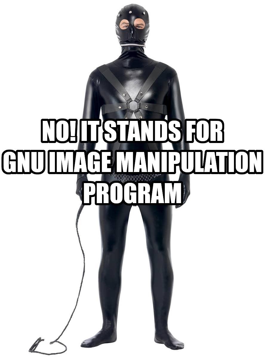
'I make all my images with the GIMP." (Cracks whip at chained up leather clad person in a leather body suit and mask) “DRAW FASTER YOU WORTHLESS POS AND MAYBE MOMMY WILL LET YOU SEE AN OUTLINE OF A TITTY LATER.”
With rare exceptions, the venn diagram of FOSS software and software names with broad mass appeal is two circles, a billion light-years apart.
Gimp ux was bad. It’s been fine for years.
Freecad is WAY newer, and has had a fraction of the developer time spent on it.
“Fine” meaning “it’s technically possible to use it.”
Adding and editing text is a nightmare. I feel like the only way you could say with a straight face is if you haven’t used Photoshop since 2006. Hell, PowerPoint has a better interface in a lot of ways.
I hate dunking on them like that but let’s not lie to ourselves here. GIMP is good enough but the UI was clearly made by engineers, not artists
“The ux is fine” doesn’t mean it’s feature perfect. I agree the text editor sucks, I use other tools like inkscape when I need text.
My point is that you CAN do those things but it’s several extra steps. I have to look up how to do things that are straight forward in other software
I’m an engineer and I have no idea what they were going for with that UI
That’s fair. I’m an engineer, too, and the UI brings me pain. Especially because my previous career had creative cloud as the daily software.
I guess I meant more the engineer mindset of “I already know how to use it so it’s good enough”
It reminds me of AutoCAD, my current daily software, which feels like a thousand bandaids stacked on top of each other over the course of 25 years.
I feel obligated to say that having a bad UI doesn’t mean it’s bad software. I’m just tired of people pretending it’s polished lol
Adding and editing text is a nightmare. I feel like the only way you could say with a straight face is if you haven’t used Photoshop since 2006. Hell, PowerPoint has a better interface in a lot of ways.
In GIMP? You select the text tool, you click it on the canvas. It’s that simple.
Ok now add a drop shadow. Curve it or add perspective.
Compare that experience to Photoshop
And CAD is ridiculously complex. Students also practice like half a year to cope with the proprietary market leaders. I sometimes think people complain because they confuse tools made for professionals with some game on easy mode.
But yeah, FreeCAD also isn’t on par with professional tools. It’s surprisingly capable and has a lot of features. And they made it crash way less. 2 years ago it used to crash several times each project when adding some chamfers or some other easy stuff and I had to do lots of stuff in order or it wouldn’t work. As of now I’d say it’s perfectly usable for the average hobby project. Just don’t expect any CAD software to be usable without any kind of background knowledge. There’s other tools for that kind of 3D design.
FreeCAD still fucks up with chamfers with annoying regularity unless you’re really careful. That being said, it doesn’t crash from it anymore.
That being said, their workflow is way better now. It used to be that you were expected to remember exact locations of vertices, so it was about 20 years of regression from where most other CAD packages were at the time. Now it’s purely graphical and you can actually connect features properly
I’ve spent 3 years learning freecad, and it’s bad, it’s entirely incapable of holding up against moderately complex projects, a simple fillet can break the whole model. It got better with 1.0 but it’s still so very far from competing with fusion or inventor / catia…
As for gimp… I’ve really tried adding it to my workflow, but it’s been a massive headache, I’d likely use photocraft over it given both options…
When was the last time you tried? Free CAD evolves at breakneck speed.
1.1 still has a ways to go. I havent worked in 1.2+ all that much
dude i’m designing something right now and freecad is just what i need. Thanks!

Freecad is NOT like gimp. They are not hell bent o forcing people to do things their way. They constantly evolve, and pay real attention to what the community wants. They are one of FOSS’ example of how things should be. I really like it and how it’s evolving.
I tried the “good UX” one back then when people hype around the update, and it still really hard to learn if you used to photoshop layout. These day, Krita is better i think, and Inkscape for the Illustrator alternative.
> “if you used to photoshop layout”
> look inside
> same layout as in Photoshop, and the panels are movable
By now I’m convinced Photoshop users lack pattern recognition.
Is it? Idk, it’s been ages i used it and i never went back since even though every time i need it and people always recommended me it.
It was bad when Gimp had floating windows. That was changed long ago. Since then, the layout is basically the same as in PS: tools on the left, layers on the right, the image in the middle. The biggest difference is probably that the tools panel isn’t in one column by default and takes some screen space — but it can be resized, though idk about the minimum width.
Oh yeah Krita is FAR better than Gimp ux wise 100℅
Krita’s brush engine is also stellar. Easily up there among the best of them.
Inkscape’s UI is very unintuitive to me, as someone used to Illustrator. The necessary tools mostly exist, but not where I would look for them.
It was made by a programmer who does not understand anything about how professional imaging people use software. It would be like an artist to somehow manages to cobble together some kind of crudely functional IDE, but he’s never programmed in his life and he doesn’t even know what programming really is.
so like vibecoders!
Cuck coders don’t need any IDEs though, they can sit with a WebUI. I think that made them insecure though so now they have resorted to flashy TUIs instead, so they can feel like 1337 pr0 h4xx0r or whatever.
Also a lot of people associate the word ‘gimp’ with something else
Isn’t GIMPs UX just old photoshop ?
Blender had years before it earned the reputation as the exception
Blender is four years older than GIMP. Blender is lightyears ahead of GIMP.
I think the trouble with art software is that Photoshop is the biggest over-complicated unwieldy piece of shit ever made, and everybody has to ape it because “it’s what artists know”.
Bring back Deluxe Paint.
Hell hath no fury like a photographer told to use UX that isn’t literally an 1:1 exact clone of Photoshop UX.
What babies.
Ironically, this attitude is a major blocker for the GIMP team when it comes to bigger UI/UX changes – there’s a vocal contingent who will react negatively to any change that requires a little adjustment to workflow or muscle memory, or even if things just look different.
Firefox’s incredibly light-touch visual changes recently are a great example of this; it’s not “this is demonstrably worse,” it’s “change makes me uncomfortable.”
I do totally appreciate that changes can be genuinely problematic for a subset of users, especially the elderly, but the vitriol that gets spewed when a project overhauls a UI embarrasses me as a user.
Side note: the GIMP UI is generally pretty good these days. There’s room for improvement, and it has a learning curve (as do all complex applications, to some degree) but it’s shed a lot of its least intuitive aspects.
Firefox’s incredibly light-touch visual changes recently are a great example of this; it’s not “this is demonstrably worse,” it’s “change makes me uncomfortable.”
On mobile the changes are more obnoxious. Tabs now take up a lot of screen real estate, despite chromium being an example of being functional and efficient at that for years.
Also, changing the look just to change the look is dumb. UI/UX changes should have a benefit to them. And what people frustratingly seem unable to understand is that newer doesn’t always mean better.
Tabs now take up a lot of screen real estate
You mean the two buttons, to show the tabs and to add a new tab?
Some people get used to how their daily tools work and look, so when the UI suddenly changes, our efficiency and comfort decreases until we tweak it to our liking and/or get used to it. The closest analogue I can think of, imagine that every few years you wake up to the furniture having been rearranged in your house.
I didn’t see the point of the Firefox redesign either, and had to spend some time in userchrome.css to make it not actively repulsive :/ A few weeks later now I reached the state of “eh ok”, but I still don’t think it’s an improvement.
If you just want the pre-Nova UI it’s probably easier to about:config > browser.nova.enabled = false
The closest analogue I can think of, imagine that every few years you wake up to the furniture having been rearranged in your house.
maybe every few years you get a new car? it does all the same things, maybe even better things with new bells and whistles, but fuck all y’all who decided to get rid of my buttons [oldmanyellsatclouds.jif]
there’s a vocal contingent who will react negatively to any change that requires a little adjustment to workflow or muscle memory, or even if things just look different.
okay but some of google’s icon changes have been really bad
will react negatively to any change that requires a little adjustment to workflow or muscle memory, or even if things just look different.
I wonder if it’s possible to build seperate UI that sits on top of the underlying backend and can be switched easily. So that ppl from PS can start quick.
I think a lot of people underestimate the maintenance burden of options like this. It’s another trope you see often with UI changes – “just let me switch it back.”
The problem is that now, even if your UI is super nicely decoupled from your engine, everything you change under the hood is likely to need at least regression testing in two places rather than one – that workload has doubled.
As it happens, though, with your specific example, there’s someone actively maintaining a GIMP
forkmod called PhotoGIMP to achieve this, but I notice despite recent(ish) commits, they’re still a minor version and a year behind.The whole conversation reminds me of this XKCD

you just explained fairly well to me why windows decided to lock the taskbar on the bottom for a while. or at least a reason they might.
Like with Linux distros and which DE you run?
there have been several, including one that tried to look like photoshop but then ended up being malware.
You get the same with Apple fans when Apple introduces something new. They all get really angry about it.
It’s not that.
Photographers went from Photoshop to lightroom quite quickly.
And other proprietary tools as well.
On the open source front many graphics people went to Inkscape instead of gimp.
Gimp methodology and UX is not landing with the majority of people and it’s not offering them enough workflow improvements to justify the learning curve.
wait until you see Lightroom vs Darktable comments :)
Amusingly, I am pretty happy with darktable. The UX is a bit kludgy, but the workflow makes a lot of sense to me. If you’ve used another mainstream RAW processor, like Lightroom, Capture One, or DxO PhotoLab, you’ll quickly be ripping through RAW files once you figure out where the handful of things you’ll frequently use are. Everything I need is supported.
I’ve made a few runs at GIMP over the years, but I’ve given up each time. It’s UI is also kludgy, but the workflows do not make sense to me. They will feel very foreign to someone who cut their teeth in Photoshop like tools. There are a ton of editors that have basically the same workflow as Photoshop. Paint.net is a good example. It’s nowhere near as full featured as Photoshop, but it’s very easy to pick up and run with if you’re familiar with Photoshop.
For decades, the only thing they needed was clean, easy Action and Macro support.
Most photographers use half a dozen pretty simple actions that they are absolutely incapable of recreating in gimp. Most photogs are technically competant in very VERY narrow fields. Most of them use paint away the ______ which just masks, sets up a specific color channel and lets you math the removal of that color with brushes.
Now, you need to add in context-aware fill, outpainting and sky replacement.
Yes, nothing says
Hell hath no fury
Like
I don’t know, I just cannot get used to it and I don’t like the shortcut keys.
Yeah its called hyperbole, you should try it sometime.
Seriously though, as someone who’s main creative outlet is game dev (among other forms of programming), if I can learn a new engine, including new languages and core concepts required to work with the new tools, they can learn to locate some icons and context menus that moved.
Like Jesus, what do said people do when their OS upgrades versions?
You’re just dismissing the claims that the UI is bad and bolstering your ability to adapt. Why can’t everyone be just like you? That’s not how the world works.
what do said people do when their OS upgrades versions?
If your question were real, you’d probably know that everyone complains about UI changes with updates. Usually it’s a temporary annoyance forgotten a week later. Other times, such as windows 11, they switch OSes. People with UI preferences aren’t broken and they don’t owe you anything. Stubbornly rejecting feedback might get you upvotes itt, but it won’t get you very far elsewhere.
I know everyone complains about UI. I’m telling y’all to get the fuck over it.
My point isn’t you have to adapt to technology as well as someone who lives and breathes it, my point is in comparison, moving around some icons and context menus isn’t that fucking big a change. Especially considering its said people who are making the tools for you.
Its a small fucking ask. Hell, If massive tech companies hadn’t spent the last 15 years weaponizing the lie that computers = convinience, mixed with the computer-illiteracy of the average smart phone user, to normalize corporate malware, it probably wouldn’t be so bad.
Before that, it was mostly just the older people and less saavy users who complained UI changes, and in those days GIMPs featureset was still a joke compared to PS.
I mean I can kinda get it when companies develop desktop software that looks like an iPad app for hand-holding reasons (see the bit above about weaponizing computer illiteracy), but fuck me, you should be able to re-learn professional software that your job/hobby depends on.
In your mind, this doesn’t strengthen the case that you’re dismissive? UI design is literally supposed to conform to the user and here you are ridiculing that extremely basic design idea and telling people intuition isn’t a thing, be a fucking robot because it’s not hard.
If you were correct I could reverse your mouse on both axes and you would just adapt. (You obviously fucking wouldn’t and neither would 99.99999% of humans)
If the issue was about basic intuition and not changing a preference which exists because that’s just how Adobe did it, you’d have a point.
These are preferences that exist because people learned a single, arbitrary way of doing things invented by Adobe, and can’t be fucked to re-find the same icon.
A cursor following mouse movements makes intuitive sense, even to people who’ve never touched a fucking computer before. Not a professional piece of software that takes training to properly use, and years of experience to master.
Your mouse-axis example is a false equivalence and you know it.
I would say that you know your “facts” are wrong, but that would imply you’ve ever taken feedback from another human, which you’ve shown here, is far off the table.
Like Jesus, what do said people do when their OS upgrades versions?
Man oh man, let me tell you: some people just never upgrade
If GIMP would just eat the complaints of their small, dedicated users, and make the UI more like Photoshop, they’d grow their userbase much faster.
Maybe, that’s why they don’t do it?
Gimp is designed entirely to be personalized to whatever workflow works best for you. You open some tabs that you want. Pin some tool boxes. move them around to anywhere on the screen, etc…
You can easily make it look like Photoshop if you want. Or you can make it look and function however you want.
Hell, I have three different layouts for Gimp that I use regularly. One for photo editing that keeps the colour and light functions front and centre. One for drawing, which keeps the symmetry tools, colour picker, brushes and paint dynamics front and centre. And one for some basic graphic design, with fonts, gradients, etc… front and centre.
That’s literally it’s design ethos.
If you’re not willing to spend five minutes doing that, that’s fine. But that’s entirely on you, not them.
That’s what Gimpshop was.
Yep. I haven’t used it in a while but I remember it being so far off the Photoshop layout and key binds I couldn’t use it.
They got the usability entirely wrong. I just can’t take GIMP seriously as photo editing software.
So meta: the original meme was a blurry photo of a tv broadcast, now it’s an ai upscale in the fuck_ai community
it doesn’t seem’s a screencap from that youtuber that paid like $1000 to purchase the full dvd set from the african broacaster, then watched hundreds of episodes to find it => https://www.youtube.com/watch?v=KP2wiN7aW4U
is this some kind of AI upscale of the meme? His skin has a fabric-like texture, uncanny 👀