In a recent discussion it was mentioned that the search function in Lemmy is awkward to use and could be improved. As a result I already made two small changes:
- Change community selector to use
!community@example.comformat (#3218) - Search field in community sidebar (#3217)

Are there any other UI or UX changes you can think of to improve searching in Lemmy? Im mainly looking for frontend changes, such as reorganizing the input positions, changing default values etc.
Being able to search in a community is already a good improvement
It’s definitely an upgrade over old Reddit for me.
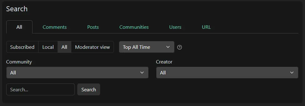
When you do a search and it returns a mix of communities, posts, comments, users… They all sorta jumble together in weird ways. Maybe the content type of the search should not default to “All” maybe it should default to “Posts” or even just blank (forcing the user to choose).
Also the mixed results all jumble together, communities and users are tiny lines of text compared to posts and comments, maybe they need to have borders or more spacing. And maybe add more info next to communities and users.
Makes sense. My idea is to use a fixed order for the different types of results, eg always put communities first, then users etc. What do you think? For communities it would make sense to display the short description as well, and for users both post and comment count?
Yea I don’t think it makes any sense to try to sort these items against each other. Maybe section headers would be nice too, a title for the
Communities:section, etc?I thought about that too, have to figure out how it can be implemented (im not very good at frontend stuff).
For post searches, could there be a [] Search Title Only? I have been reading a post and had my client crash and was unable to find the post again, despite recalling some or all of the title.
I also do a foreign word of the day and when I want to check if I am duplicating a post I have to skim through all of the posts that include that word.
Good point, this is one of those features which is already implemented in the backend but not added to lemmy-ui yet. Made a pull request for it.
I’m not a UI or UX expert, but I wonder if it would make the search page nicer if instead of the search target (form select) would be tabs instead of a dropdown since it is distinct selection from the other filters in the search?
using bootstrap tabs (I didn’t put any effort into styling just added bootstrap tabs and removed the form select butto dropdown):
Edit: now that I think about it, the tab might be kinda confusing unless also the other dropdowns are slightly altered to give more context in the current form selection tab, e.g. (text changes):

But yeah I just wanted to throw out ideas, I’m not sure about them myself. The search inside a community is nice addition!
I think if you do this, then the tabs for communities, users, and URL would no longer have the drop down to choose community because it’s meaningless for them. They probably wouldn’t have the “Top All Time” filter either. There could probably be more differences for each tab, maybe this is the way to go.
Yeah there’s a lot to consider here, good points. The language specific texts too to make it more search selection context based. This would need to be thought through to not make it more confusing.
The tabs could make sense, but then they should be between the search bar and results, because each tab has the same buttons. You can make a pull request with what you have so far and then we can discuss it in detail.
Ah good point!
I’ll hopefully manage to set up lemmy-ui locally at home after work and make that pull request - I edited that in with webdev tools since didn’t want to lose that thought before I get home (sorry if this just pollutes the discussion).
No worries. Make sure to follow the documentation on join-lemmy.org for development, and use the
release/v0.19branch for both lemmy and lemmy-ui as the main branch is currently broken due to 1.0 changes.Will do, thank you!
As far as I remember, the loading indicator disappears when the local search is finished and the search appears to be done, even when the remote search is continuing. This makes finding a new remote community pretty awkward.
Right, this is because it currently uses two separate api calls for search and resolve object. It will be fixed in 1.0 with https://github.com/LemmyNet/lemmy/pull/5752.
One of my most favourite things was watching the wizards over in r/BotDefense killing shitbots enmass via the open API weddit had until spez got even more greedy.
I know it’s not directly tied to what you’re asking via the UI, but I am interested in how you could help some of those excellent bot hunters of day gone yonder.
<3
Lemmy has an open API, and instance admins have even more data available by accessing the database directly. One of the lemmy.world admins is also working on a feature for vote analytics, though at Lemmy’s current size it seems very low priority.
When resizing Lemmy in browser to half screen by dragging it to the side my top bar with communities and create post dissapears.
have you tried clicking the hamburger menu in the top right?

Ah thanks there it is. I thought it would be next to the other big buttons

I have taken a bit to realize this before too. Maybe the hamburger button could be highlighted better when the page is in that narrow layout?
I think the communities button is especially important because it’s mainly how I navigate Lemmy. Create post is handy too. Create community not really.
@Nutomic can we get these buttons back in smaller view?
add a big button that says “kill this redditor” you just press it and lemmy assassins kill the guy… Also add lemmy gold.